Make sure you are logged in to your admin UI. Click on ‘analytics’ in the main navigation menu and proceed to click on ‘traffic overview’ in the subnavigation menu.
Basically, the traffic overview offers you insights in the distribution of different KPIs across your tracking channels and the devices your customers are using. The overview allows you to work with different KPIs, such as the number of conversions, ad impressions or amount. They will be discussed in more detail below.
The distribution is displayed in a graph, which has three different modes:
Over time: you select a period (a week, a month, etc.) and see the development of the distribution during the period you selected.
Composition: you will see a complete breakdown of the KPI for the period you selected.
Range: you will see key statistical figures related to the distribution, such as the median.
Furthermore, the overview offers you a table called ‘traffic split’ containing all KPIs. You can use this table for differentiation:
If you are looking at the distribution across the channels, you can specify the figures on the level of the category, the subcategory, the company and the ad space.
If you are looking at the distribution across the devices, you can specify the figures in relation to the operating system on the device.
The traffic overview offers you to use several KPIs. For a comprehensive explanation of the KPIs, please read this article. Please note the CR, the CTR, the eCPA, the eCPC, the eCPM, the confirmed amount and the net ROI are only available in the traffic split table at the bottom of the page.
The distribution across the tracking channels follows the attribution priorities as defined in the attribution manager. Therefore, the report cannot consider attribution groups.
To use the report, you need to select the data you want to consider. You do this in the panel at the top of the page:
First, you select the period you want to take into consideration. You can use a dynamic timeframe, such as the current week or the last three months, or use the custom timeframe.
Once you have selected the period, you select the advertisers. Please note that you can select multiple advertisers.
After you have selected a period and one or more advertisers, hit the ‘search’ button in the right lower corner of the panel.
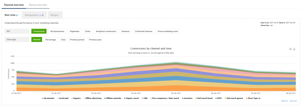
After you have selected your data and hit the ‘search’ button, the graph in the middle of the page will look more or less like this:
By default, the distribution across your tracking channels over time will be displayed. If you want to see the distribution across devices, use the tab ‘device overview’. The tabs below allow you to display the distribution over time, the composition and the range. You can use the buttons under ‘KPI’ to change the KPI you are looking at.

As was discussed above, you can not only use a graph visualizing the distribution over time, but also graphs visualizing the composition and the range of the distribution. For every graph, there are some import points to notice. Let’s discuss them in detail.
Under ‘chart type’, you can use several buttons to change the display mode of the graph:
By default, the distribution will be shown stacked, i.e. the numbers will be accumulated. You can use the button ‘stacked’ to go back to this display mode.
If you choose ‘percentage’, the distribution will be shown as a percentage.
You can also choose to display the total number for the KPI you chose by clicking on ‘total’. If you do so, you won’t see a distribution anymore, but the graph will allow you to compare your numbers with the previous period or the same period during the previous year, by clicking on the corresponding buttons.
Other points to note are:
Below the graph, you will find an explanation of the colors used for the different tracking channel. By clicking on a dot, you can filter out a specific tracking channel. Additionally, you can choose to hide all or select all by using the corresponding buttons in the right lower corner of the graph panel. This comes in handy when you want to have a look at one tracking channel in particular.
If you scroll over the graph, a table will appear explaining the colors used for the different tracking channel again. The table also contains the exact KPI numbers per day.
If you are using a longer period and you want to zoom in, click on the point where you want to start and drag your mouse over the graph until you find the point where you want to stop. To reset the zoom, use the ‘reset zoom’ button in the right upper corner of the page.
If you select the ‘composition’ tab, you will see two graphs looking more or less like this:
In the graph on the left, the KPI will be split by channel. Points to notice are:

As with the previous graph, you can filter out specific tracking channels by clicking on the corresponding dot in the legend below the graph. To hide or show all the tracking channels, use the corresponding buttons in the right lower corner of the graph panel.
If you scroll over the graph, a table will be displayed explaining the tracking channel, the figure and the percentage in relation to the entire number of the KPI.
In the graph on the left, you will find a chart visualizing the distribution in percentage. If you scroll over the graph, you can display a table containing the exact figure of the KPI for every tracking channel. By clicking on the corresponding piece, you can make it stand out.
If you select the ‘range’ tab, you will see a table looking more or less like this:

As was discussed above, this graph displays important statistical figures related to the distribution of the selected KPI across your tracking channels. For every channel, you will see a line running from left to right. In the middle, there is a bar and a red vertical line. Let’s go through the details:
The figure at the beginning of the line represents the lowest amount for the KPI you generated on one day, during the period you selected.
The figure at the end of the line represent the highest amount for the KPI you generated on one day, during the period you selected.
The figure in the middle corresponds with the red vertical line and represents the median for the KPI you generated during the period you selected.
When you scroll over the bar, these figures will be displayed in a table, along with the lower and upper quartile. The figures correspond with the beginning and the end of the bar.
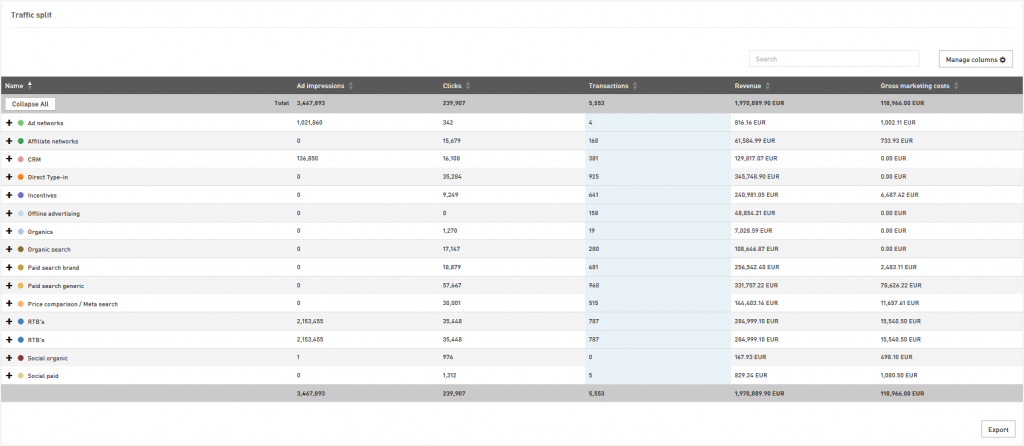
As was mentioned above, you can use the traffic split table to differentiate the distribution of your traffic across your tracking channels and your customer’s devices. To switch between channels and devices, use the tabs above the graphs. For the channel distribution, the table will look more or less like this:
On the left, in the ‘name’ column, you will find the names of all your tracking channels. In the other columns, you will find figures related to the KPIs mentioned in the header. Please note that you can add KPIs by clicking on the button ‘manage columns’ in the right top corner of the page. Just select the tick box next to it and click on the button ‘reload’ at the bottom of the menu. You can also remove columns by unticking the corresponding boxes.

To specify your figures, go to the column on the left and click on the plus icon next to the name of the tracking channel. If you do so, you will see that the row of the tracking category folds open, displaying the ad space categories related to it. The figures related to the categories will be displayed in the corresponding row. For their turn, the categories can be fold open using the plus icon. You can specify your KPIs on the following levels:
Tracking channel
Category
Subcategory
Company (partner)
Ad space
If you are looking for a specific company or ad space, using the search box in the right top corner of the panel is recommended.
You can also use the traffic split table to specify figures related to the distribution across your customer’s devices. Just use the tab above the graphs to switch to ‘device overview’ and scroll down to the table. If you do so, the table will look more or less like this:
Again, you will find the names of all devices used on the left, in the ‘name’ column. In the other columns, you will find figures related to the KPIs mentioned in the header. You can add KPIs by clicking on the button ‘manage columns’ in the right top corner of the page. Just select the tick box next to it and click on the button ‘reload’ at the bottom of the menu. You can also remove columns by unticking the corresponding boxes.

To specify your figures, go to the column on the left and click on the plus icon next to the name of the tracking channel. If you do so, you will see that the row of the device folds open and displays the operating systems used on the devices. The figures related to these operating systems are in the corresponding row. Please note that you can also reverse the table and display the operating systems on the highest level. To do this, use the tabs directly above the table.
If you are looking for a specific operating system is might be rewarding to use the search box in the right top corner of the panel.